What are Dark Patterns? How UI Influences Consent and Compliance
Jeffrey Edwards |
Privacy & Compliance | January 23, 2023

Have you ever tried to cancel a subscription service, or withdraw online consent, only to find yourself in a maze of never-ending submenus that seems like it was dreamed up by MC Escher himself?
It only took a few seconds to sign up for this service, but now you’ve spent 45 minutes clicking around only to find that you have to get a representative on the phone to cancel your $14.99/mo service, and they’re experiencing “higher call volume than normal” so you may need to be patient.
While this may seem like simple poor customer service, make no mistake, it’s an intentional poor user experience– in fact, it’s often considered a best practice.
We’ve all experienced them. Online user experiences that are designed to make our lives harder. As regulations designed to protect consumer data and guarantee online rights proliferate, so do these so-called “dark patterns”—UI designs intended to subvert these regulations by frustrating user experience and guiding users towards actions and outcomes that may not be in their best interest.
Now, dark patterns have come under more scrutiny than ever, as the Federal Trade Commission warns that it is investigating what it calls Negative Option Marketing — the FTC’s term for dark patterns that take consumers’ silence as implicit consent for situations like subscription renewals and free trials that will begin billing automatically after expiration.
But what, exactly, are dark patterns? To better understand the FTC’s warning, let’s take a look at some common examples of dark patterns and how these UX choices affect compliance with data privacy regulations like the GDPR and CCPA.
What are Dark Patterns?
Dark patterns are essentially user experience (UX) tricks that websites and apps use to discourage certain actions, deliberately obscure information, or mislead users.
The term was first coined in 2010 by UX specialist Harry Brignull, who went on to launch DarkPatterns.Org to name and shame perpetrators, but the practice has been going on much longer than that.
For example, burying unpopular stipulations inside lengthy terms of service agreements that few — if any — consumers ever read is a dark pattern that is as old or older as the internet itself.
The FTC, the California Consumer Protection Act (CCPA), and the EU’s General Data Protection Regulation (GDPR) all require clear and obvious consent, albeit in different contexts and situations. In most cases, dark patterns are explicitly in violation of these regulations and certainly go against the spirit of the laws.
Struggling with consent management and compliance? CHEQ can help. Schedule a demo today.
Examples of Dark Patterns
Dark patterns can be as subtle as making the unsubscribe button for a mailing list very small, buried in the text, or using a low-contrast color. Compare that to the big and bold BUY NOW buttons on an email or landing page.
Dark patterns may fail to disclose or make it difficult to find the notice that a free trial offer will automatically convert into a paid subscription. Sites may make it easy to sign up for programs, but purposely difficult to cancel.
Dark patterns can also make it difficult for consumers to understand how their data is being collected, stored, or processed. Tactics make a difference, too. For example, when granular controls for opt-out are provided at the same place as the request, consent declines by as much as 20%. However, removing the opt-out button and details from the page increases consent by about 22%.
The Stanford Digital Civil Society Lab has set up a dark pattern tip line for consumers to report dark patterns. You can see a list of the tricks and techniques being deployed on their website. Here are a few of the ones they say demonstrate dark patterns.
This example asks customers to review their choices when selecting an airline ticket. The more expensive Main Cabin option is presented as the default choice with a large red “Move to Main Cabin” button and a small “Accept Restrictions” with a checkbox to select Basic Economy. Consumers may not realize that clicking the red button is making a choice and think they are merely moving to the next stage in the ticket buying process.
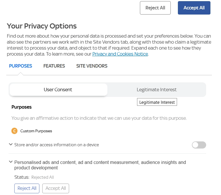
This example is confusing and complex. It does not provide an easy, intuitive way to disable cookies.
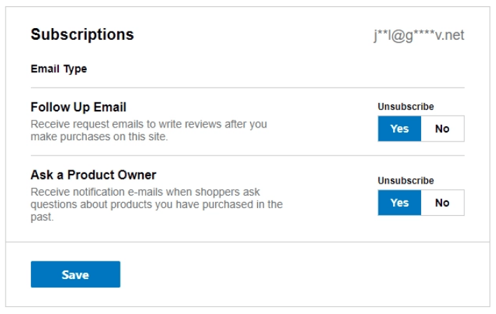
In this example, the choices for opting out appear to contradict each other. While the text asks if you want to receive emails, the ‘Yes’ button is highlighted under the word “Unsubscribe” giving the impression that hitting ‘Yes’ will unsubscribe you when, in fact, it continues your subscription.
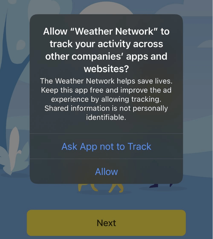
In this example, an app tries to encourage to allow cross-site tracking for advertising purposes by using the rationale that the app saves lives.
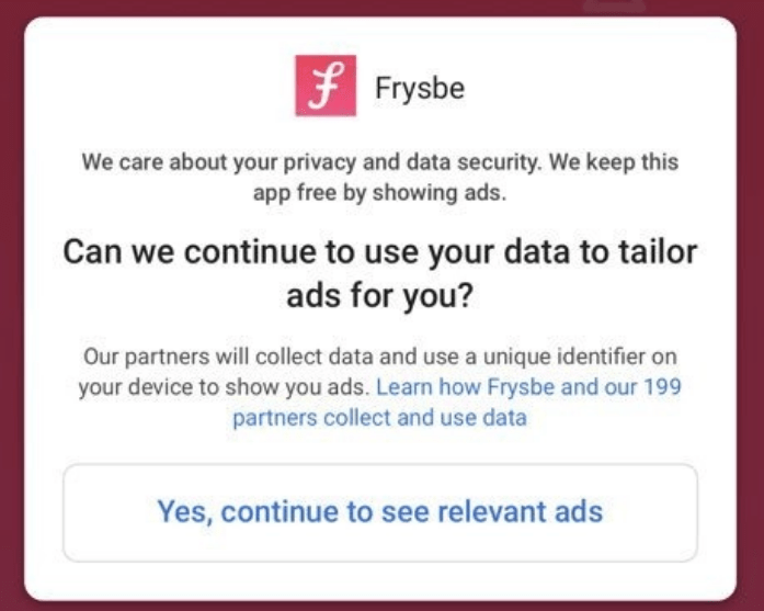
This app asks users if it can collect data, but does not provide an option for declining.
As you can see, there’s quite a variety of tactics companies use to influence consumer behavior. Some are subtle and others are overt.
Dark Patterns, GDPR, and EDPB Guidelines
The EU’s General Data Protection Regulation (GDPR) went into effect in May 2018 and was intended to provide more transparency to users and help them gain control over their personal data. While the GDPR requires companies to ask for explicit consent, four years later, many companies studied have failed to design their sites to comply.
The original text of the GDPR does not specifically define dark patterns, it instead defines consent as “any freely given, specific, informed, and unambiguous indication of the data subject’s wishes by which he or she, by a statement or by a clear affirmative action, signifies agreement to the processing of personal data relating to him or her.” In other words, users have to be able to understand how data will be used and explicitly agree to its use.
However, following multiple complaints against dark patterns filed by privacy activist group noyb in 2020 and 2021, a taskforce was formed by several EU Data Protection Authorities (DPAs), lead by France’s CNIL, in order to investigate and provide guidance on dark patterns. Last week, that taskforce published a report summarizing their findings, and detailing the guidelines for compliant consent banners.
This report states that the vast majority of DPAs consider that the absence of any option for refusing/rejecting/not consenting cookies at the same level as the one provided for accepting their storage constitutes a breach of the legislation (Article 5(3) of the ePrivacy Directive).
Regarding disingenuous cookie banner designs, the authorities concluded that the information provided in a banner must “enable Internet users to understand what they are consenting to and how to express their choice.”
However, DPAs also agreed that they cannot impose a standard in terms of color or contrast on all websites, and that a case-by-case review of banners would be required to determine if chosen designs were or were not obviously misleading to users.
Here are some examples of dark patterns that would violate the intent of the GDPR:
- Forms that require users to uncheck a box to opt-out (opt-out consent)
- Considering the use of a site or service as consent in and of itself (implied consent)
- Accept all buttons without options to consent to specific data use
In these examples under the GDPR, sites need to:
- Ask for explicit consent
- Eliminate pre-checked boxes, and make opt-in consent the norm
- Make accepting terms as easy as rejecting terms
If website visitors or app uses have to go hunting for the information to deny data collection or sharing, make it difficult to clearly understand options, or favor opting without giving equal access to opting out, it’s a violation of the GDPR.
The GDPR provides mechanisms for regulators to levy fines for dark patterns and other tactics it deems deceptive.
For a more in-depth look at the GDPR’s consent management requirements, check out our Guide to GDPR Cookie Compliance.
Dark Patterns and CCPA/CPRA Compliance
Both the California Consumer Privacy Act (CCPA) and the California Privacy Rights Act (CPRA), which will supersede it, require similar levels of transparency as the GDPR. The CCPA prohibits publishers from using confusing language, unnecessary steps, or sales pitches aimed to influence behavior before opting out.
The CPRA goes so far as to define dark patterns as “a user interface designed or manipulated with the substantial effect of subverting or impairing user autonomy, decision-making, or choice.” The CPRA states plainly that any consent obtained by the use of dark patterns does not constitute consent.
The final regulations for the CCPA also included a few examples of behaviors that violate the regulations, such as:
- Requiring consumers submitting an opt-out request to take more steps than the process for opting in.
- Requiring consumers to click through or listen to reasons why they should not submit an opt-out request before confirmation.
- Forcing consumers to provide personal information that is not required to complete the opt-out request.
- When consumers click on a link about personal information, they should not have to search or scroll through privacy policies or blocks of text to find out how to opt-out.
The CCPA allows businesses using dark patterns in violation of the Act 30 days to fix the problem or face civil penalties.
What’s Next? FTC Fines and US Legislation
While dark patterns aren’t exactly new, regulators have indicated they are looking more closely at these practices. Besides the GDPR and CCPA/CPRA, we see increased regulatory activity.
Section 5 of the FTC Act gives the Commission the authority to prosecute companies for unfair or deceptive trade practices. It recently brought suit against Age of Learning, Inc. (ABC Mouse), alleging misrepresentations about cancellations, failure to disclose important consumer information, and making it difficult for consumers to cancel. The company agreed to a $10 million settlement and change practices.
In 2021, the FTC warned businesses using dark patterns that they were at significant regulatory risk, and in 2022, the agency released a report detailing and analyzing dark patterns and their impact.
Finally, in December of 2022, the FTC fined ‘Fortnite’ video game developer Epic Games $245 million for their use of dark patterns, which the agency alleged used design tricks to charge customers for virtual merchandise without their express informed consent. When customers disputed unauthorized charges with their credit card company, Epic allegedly locked their accounts, depriving them of access to content they had already paid for.
According to the FTC’s complaint, Epic set up its payment system so that it saved by default the credit card associated with the account, allowing kids to easily make in-game purchases with the press of a button–without requiring separate cardholder consent.
FTC complaints also accused the company of designing in-game purchases in a manner that made it easy for users to accidentally make unwanted charges, such as by placing the purchase button too close to other buttons.

